FinTech
Personal Finance Dashboard: The Power of Interactive Charts and Performance Movers Features in Budgeting Apps


Of all the information that our brain processes daily, 90% are visuals. Now, imagine how complex and large these datasets can be; analyzing them could be overwhelming and challenging.
That’s why budgeting apps have personal finance dashboards with interactive charts and performance movers to translate complex data into understandable and visually compelling representations. These features help businesses find hidden patterns and disparities while also allowing users to track their investments and wealth in a clear and engaging way.
This blog post provides valuable insights into the importance of data visualization in wealth management software solutions and how businesses and individuals can utilize it to uncover hidden insights and achieve better financial outcomes.
Personal Finance Dashboard: Visualizing Wealth Structure with Data
Visuals are essential to humans, and the reasons for this are deeply rooted in our biology. Did you know our brain processes visual content significantly faster than text-based data? One interesting research has shown that our brains can do it in as little as 13 milliseconds while processing written information takes significantly longer.

This information can serve as a confirmation that visuals matter for a better user experience. Especially dealing with long-format, complex information and calculations involved in the wealth management structure.
In fact, every wealth management software solution requires tools to present data visually. The choice of these tools directly impacts the effectiveness and clarity of conveying financial information to users. To learn more about the approaches in data exchange in finances, you may also want to explore financial API use cases.
In the context of the wealth structure, this is a visual picture demonstrating how individuals' assets and financial resources are organized. Wealth structure differs greatly from person to person, shaped by factors like income sources, investment portfolio, real estate holdings, business interests, and other assets.
Visualizing wealth structure means creating diagrams and charts representing the different components of an individual's wealth. In this regard, data visualization becomes even more essential as it helps individuals to simplify complex financial information, breaking it down into graphs, interactive charts, and performance movers.
Interactive charts provide real-time data visualizations (for example, to show the distribution of wealth across different investments, industries, or geographies) that allow users to navigate through complex financial data easily. Performance movers provide a dynamic way to track the performance of investments and portfolios over time.
So, data visualization not only simplifies financial data but also helps people identify key areas that need attention and evaluate the effectiveness of their wealth management strategies. Moreover, trends, patterns, and insights might not be immediately obvious when it comes to working with raw data. Visual representation of these findings lets users quickly grasp the key insights and encourage them to make more informed financial decisions, leading to increased engagement.
Overall, we believe these techniques help businesses and individuals alike read between the lines and focus on the core to achieve financial goals faster. We also believe that quality fintech software development services should not compromise on either customer security and ease of use.
Benefits of Interactive Elements in Personal Finance Dashboards
When clients encounter a vast amount of information in the wealth management structure, a common question may arise: "How am I doing financially?". Not too long ago, this data might have been represented in a plain statistical report. Thanks to advanced technologies and data visualization tools, the drawbacks of traditional reports have become obvious, leading to a change in this tendency. Today, Fintech companies use interactive charts and the performance movers feature to visualize wealth structure to achieve plenty of benefits.
Easy information distribution and transparency
Interactive charts and performance movers simplify how wealth managers share complex financial information with their clients. Instead of overwhelming spreadsheets or lengthy reports – visual tools offer a clear and concise view of wealth structure, helping clients understand their finances at a glance. With enhanced accessibility and transparency, communication improves, and clients can easily see how their assets contribute to their overall wealth. It's a win-win for everyone involved.
Decision-making ability
Visualizations help clients to make better decisions about their wealth management strategies. When they see various wealth structure components in a clear visual format (different types of charts), they can quickly identify areas that may require attention or adjustments. Or, they can analyze the performance movers, which show how different investments affect their overall wealth.
So, by engaging with these visuals, clients can explore different scenarios and make strategic decisions about their asset allocation, diversification, and investment choices. This decision-making ability helps clients in maximizing their returns and optimize their wealth management plans aligned with individual goals — a wise choice for creating a more promising financial future.
Public awareness of economic disparities
Visualizing wealth structure can help raise public awareness of economic disparities. For example, when wealth management firms aggregate anonymous data from different clients, they can create visualizations showing how wealth is distributed across different demographics or regions.
These visuals highlight gaps in income inequality and encourage discussions about economic justice or if there is a need for inclusive financial policies. We believe this is a powerful way to make people think about and solve these important questions on time.
Risk management
Visual representations of wealth structure are like treasure maps for clients and wealth managers, guiding them through the risky waters of investment options.
When it comes to evaluating various investments, like stocks and bonds, clients can use interactive charts to analyze historical trends and identify potential risks on the spot. At the same time, performance movers show how changes in the market affect the total wealth structure and provide important information about the risks involved with each investment.
With this information in mind, wealth managers can guide clients in managing their portfolios more effectively, optimizing risk levels without compromising potential returns.
Improved client experience
All of the benefits discussed above amount to improved client experience and increased engagement. Visual representations create a more engaging experience compared to traditional text-heavy reports. So, clients are more likely to be interested in their financial matters, leading to more proactive financial management.
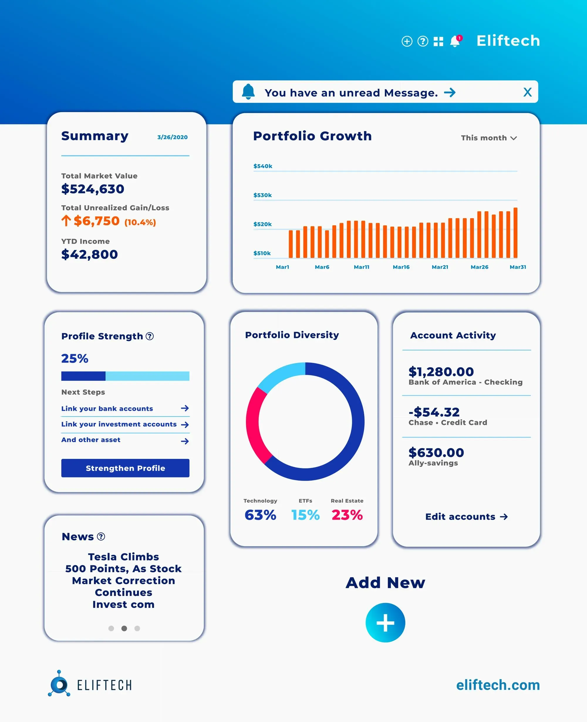
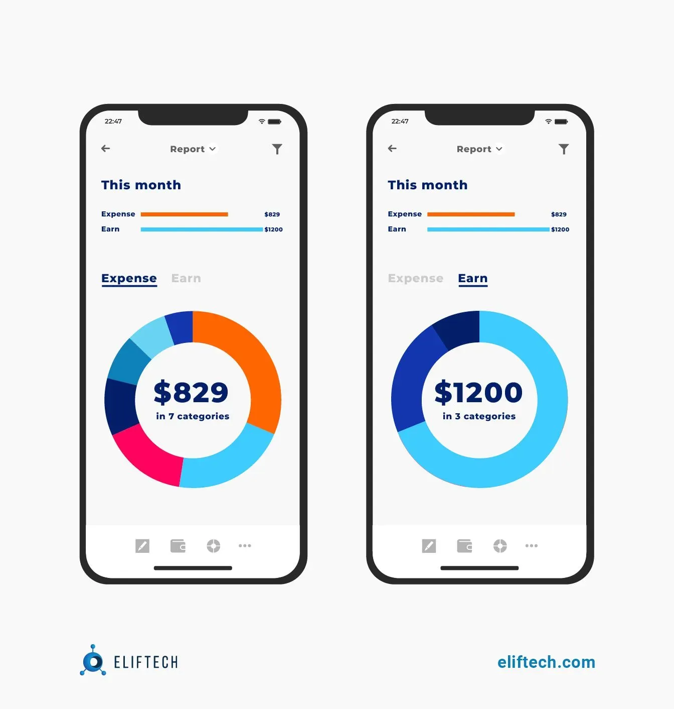
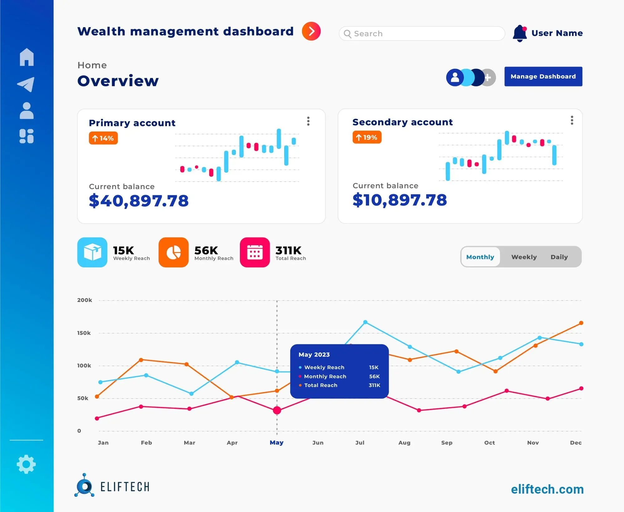
Interactive Charts
We all know that numbers are the foundation of a wealth management structure. Interactive charts do a great job in this regard, as they help transform those raw numbers into a visually engaging picture that even the most non-financial savvy individuals can understand and make use of.
Since wealth management software solutions use various kinds of data, they will require different visuals depending on what they show. When it comes to visualizing wealth structures, users can view different types of interactive charts to take a holistic view of their assets.
Pie chart
This is the most classic choice for displaying the distribution of wealth across different asset classes or investment portfolios. Each pie slice represents a certain category and the amount of wealth it contains. Interactivity allows users to click on a slice to get detailed information about the specific asset's value and percentage within the overall wealth. Additionally, tooltips can provide additional insights when hovering over each slice.
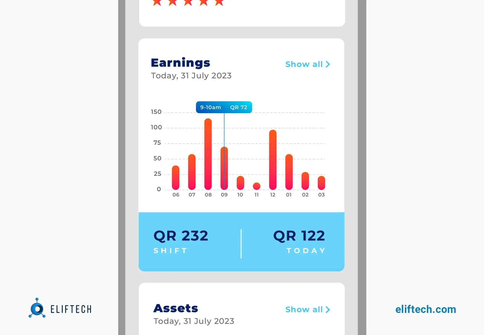
Bar chart
Bar charts are great for estimating the relative values of the various wealth components. They are suitable for representing a specific asset or financial measure, such as income, expenses, and assets, and the length of this bar chart directly corresponds to its value. Adding interactive features will allow users to interact with the data dynamically. For example, users can hover over bars to see exact values, making it easier to understand relative proportions and identify areas of focus.
Line chart
These types of charts are ideal for displaying the historical performance of investments over time. Such charts display wealth growth as a continuous line, allowing users to observe trends, fluctuations, and patterns in their portfolio's value. Interactive features such as data points and tooltips provide accurate information for specific periods, thereby enhancing analysis.
Bubble chart
These interactive charts use circular markers to represent data points. The size of each circle corresponds to the value of the represented data point. This type of chart is suitable for presenting data with several dimensions, such as asset allocation and risk. The location of the bubbles can represent a return on investment, with larger bubbles indicating higher returns.
Also, the bubble's color and shape can represent different data dimensions, such as liquidity, quality, or volatility. Interactive features such as filtering allow users to show or hide circles based on risk level or asset class criteria.
Treemap
A treemap is an excellent choice for illustrating hierarchical data structures, making it useful for visualizing the diversification of assets within portfolios. The size of each rectangle represents the wealth's value, while colors or shades can denote different asset categories. Users' ability to zoom in and out allows them to explore the hierarchy at different levels.
Performance Movers
Keeping a close eye on changing wealth dynamics is crucial for making informed decisions. Yet, imagine you have a tool that not only tracks changes in wealth distribution but also presents them in a visually captivating way. This is all a description of a performance mover feature that has the ability to visualize changes in wealth over time. This tool is a must-have for tracking and interpreting wealth structure, and here’s why.
- Illuminates dynamic changes in wealth distribution over time
This feature brings to life the evolving dynamics of wealth in a visually engaging manner. It becomes possible by using interactive charts, graphs, or heat maps. They depict the movement of wealth among various categories and assets. Whether it's tracking investment portfolios or economic sectors, the structured wealth management platform can provide customized settings to performance mover feature to highlight specific areas of interest. - Highlights shifts in wealth among different groups, sectors, and regions
One of the key advantages of the performance mover feature is the ability to classify and contrast changes in wealth among various groups. These groups may include sectors, industries, geographic regions, or even individual investment portfolios. By comparing the performance of diverse groups, clients can gain insights into which areas are experiencing growth, which ones are stagnating, and which are facing challenges. - Offers insights into wealth dynamics and economic trends
The significance of tracking performance movers goes beyond wealth management tasks only. Understanding wealth dynamics and economic trends is also vital for policymakers, economists, and researchers.
For example, investors and analysts can identify the drivers behind the success or decline of specific assets or sectors, e.g., patterns of income inequality, economic disparities, or the effect of policy interventions. With this information in mind, they can make well-informed decisions regarding investment strategies to reach economic growth.
Here are real-world examples showcasing how performance movers are represented in various existing wealth management platforms.
Morningstar's "Fund Performance Mover" allows investors to see how the distribution of wealth has changed among different funds and understand how market trends have affected their performance.
Bloomberg's "Sector Performance Movers." This platform offers a dynamic tool highlighting the market's top-performing and underperforming assets (stocks and bonds, in our case). Traders and investors can quickly identify assets that are performing well or poorly and improve their investment strategies.
Best Practices for Implementation of Interactive Elements in Personal Finance Dashboards
Interpreting wealth structures in a visual format can be challenging for designers without prior experience in this field. Due to its complex nature, we recommend following best practices and guidelines to ensure the wealth visualization is accurate, engaging, and accessible to a broader audience.
Practice #1. Ensure data accuracy and clarity
The most important factor to consider when developing visualizations showing the structure of wealth is accuracy. Before creating a chart or graph, check the underlying dataset to ensure it's up-to-date, complete, and accurate.
Useful tips from our design team:
- Regularly update data sources to maintain relevance and reliability.
- Use clear and concise labels for assets, sectors, or regions to avoid confusion and enhance understanding.
- Avoid cluttering. The chart should not have too many data points or extra details. Instead, focus on presenting the most relevant insights.
Practice #2. Keep user experience in mind
Interactive charts should be easy to use, easy to navigate, and highly responsive to user input. Users should be able to zoom in, filter data, or access additional information when interacting with a wealth visualization in a chart.
Useful tips from our design team:
- Keep the charts simple and intuitive to navigate, catering to users of varying financial expertise.
- Provide tooltips and interactive elements that offer additional information when users hover or click on data points.
- Optimize for responsive design to ensure a seamless experience across different devices.
Practice #3. Use appropriate color schemes
Color is a powerful tool to highlight the distribution of wealth across different sectors, regions, or age groups. How designers do it - is also important. When choosing color schemes, it is vital to choose them thoughtfully to emphasize crucial points in the visualization.
Useful tips from our design team:
- Choose color schemes that are visually appealing and facilitate quick understanding.
- Use consistent colors to represent specific categories or groups.
- Don’t use too many colors since they can confuse users and take their attention away from the main message.
Practice #5. Utilize appropriate labels and interactive features
Labels and interactive features can help users to understand complex concepts and trends easily. Use labels to draw attention to crucial data points and add more context. Interactive elements such as tooltips, annotations, and overlays can display additional information on hover or click.
Useful tips from our design team:
- Implement interactive tools that allow people to drill into specific data points for further in-depth analysis.
- Offer customizable options, such as time period selection or asset filtering, to tailor your wealth visualization to individual preferences.
- Turn on the zoom and pan functions for easier viewing of detailed data.
Practice #6. Pay attention to consistency and branding
When it comes to visualizing wealth structure data, consistency plays a huge role. This consistency, in turn, promotes trust and familiarity between users and allows them to recognize the visualization and associate it with your brand or platform.
Useful tips from our design team:
- Maintain consistency in chart styles and layouts across different sections of the wealth visualization.
- Include branding elements in the visualization, like logos or color palettes, to ensure that it reflects your business's brand.
Want to create meaningful visualizations for wealth structure data? Our UI/UX design services will help you create engaging, interactive charts that effectively showcase wealth distribution trends and patterns.
The Future of Wealth Visualization in Budgeting Apps
Technology never stands still, so new data visualization trends and innovations offer more exciting ways to visualize wealth structures. So, by staying up to date with them, you can ensure that your company always remains one step ahead of competitors.
Augmented Reality (AR) and Virtual Reality (VR) visualizations
AR and VR technologies are making their mark across numerous industries, including the wealth management sector. Augmented reality allows users to overlay interactive visualizations in the real world, making financial data more immersive and accessible. Conversely, VR offers a total immersion, allowing users to explore and interact with their wealth portfolios in a virtual environment.
The potential value of AR and VR for wealth structure visualization:
- With the help of AR and VR graphics, users can interact with their financial data more interestingly and naturally.
- These innovations can improve financial literacy and empower users to make wiser investment choices.
- When meeting with clients virtually, wealth managers and advisors can deliver customized wealth visualizations in a more engaging way.
Artificial Intelligence (AI) and Machine Learning (ML) for personalized visualizations
These advanced technologies use vast amounts of financial data to identify patterns and trends unique to each business scenario. AI-powered algorithms enable leaders to access personalized wealth visualizations, considering vital aspects like income, assets, and specific financial goals. Furthermore, AI and ML provide customized recommendations and data-driven guidance, empowering businesses to optimize wealth management strategies.
The potential value of AI and ML for wealth structure visualization:
- Wealth visualization with AI can respond instantly to changing financial circumstances of clients.
- Depending on each client's financial goals and risk tolerance, individual visualizations can offer tailored investment recommendations and strategies.
- ML algorithms can analyze historical data and market trends to make predictions and alert users to potential risks.
Gain in-depth knowledge of the use of AI and ML and their potential impact in our recent blog post on artificial intelligence in wealth management.
Blockchain for wealth data visualizations
Just like AR and VR technologies, blockchain has the potential to revolutionize the methods wealth management companies, advisors, and users utilize to track and verify wealth structures. By offering a decentralized and secure way to keep track of assets, blockchain can make the distribution of wealth more accurate and transparent. Blockchain technology can increase financial transparency and democratize wealth structures by giving the public greater access to wealth data.
Conclusion
When it comes to communicating results and data to users, one thing is clear: show rather than explain. That’s why wealth visualization is vital for developing a simple and convenient way to manage wealth. In this context, interactive charts and performance movers are a powerful combination for wealth structure visualizations that help deliver complex data sets to users in a simplified and consistent manner. With the ability to dive deeper into the crucial data, users can explore the details and gain deeper insights as needed. So, we consider these features to be must-haves in the feature lists of any reputable wealth management platform.
Get a more in-depth consultation for visualizing the wealth structure essential for your business. Contact our experts and book a free call.